


Want to design your own app but don’t know where to start? This is the guide for you. We’ll begin with the basics before progressing to complex design ideas. By the end of the article, you’ll understand the importance of a well-designed user interface and know how to create your own.
Mobile App Design Basics
You need to be aware of two terms when designing your apps: user interface (UI) and user experience (UX). The UI covers all the aesthetic choices – everything relating to how the app looks. This can get pretty broad but think about: fonts, colour scheme, buttons and images. It’s all about making the app visually appealing.
The UX on the other hand is about usability – does the app work as it’s supposed to? This considers how users will interact with the app at every stage. It thinks about the common ways a user navigates through the screens. The goal is to make the UX enjoyable and intuitive.
Keep both UI and UX in mind as you create your app. When designing your app, we recommend using a methodological approach. Skipping steps usually leads to more work. Let’s get started:
1. What is it going to do?
You need to decide what you want your app to do. This is more than deciding you want to make a music app. You need to consider each feature you want your app to have. Will it have playlists, controls, support for smart speakers, offline mode? The list of potential features is endless. The more you can identify upfront, the less work you’ll have later on.
For a big picture view of this process, check out our guide: ‘Learn how to build an app: advice from a master builder’.
2. Which platforms do you want your app on?
Next, you need to decide which platforms you want your app to be available on. The design guidelines will differ depending on if you’re trying to build a Web, Android, or iOS app. If you’ve ever seen someone using an operating system (OS) they’re not familiar with you’ll understand the importance of this.
3. Research your competitors
According to Statista, the Google Play store has 2,950,000 apps available to download. There’s a very good chance someone else has come up with a similar idea to yours. That’s not a bad thing – it makes your life easier!
Download the top few competitor apps and play around with them. We’re not advising plagiarising their work; explore their app for features you overlooked and pay attention to how they’ve set up the navigation. Have they made any unexpected features a key part of the UX? Why would they choose to implement it that way?
How to design an app?
Now that you have a rough idea of what you want your app to do, it’s time to begin creating materials that help us visualise the app.
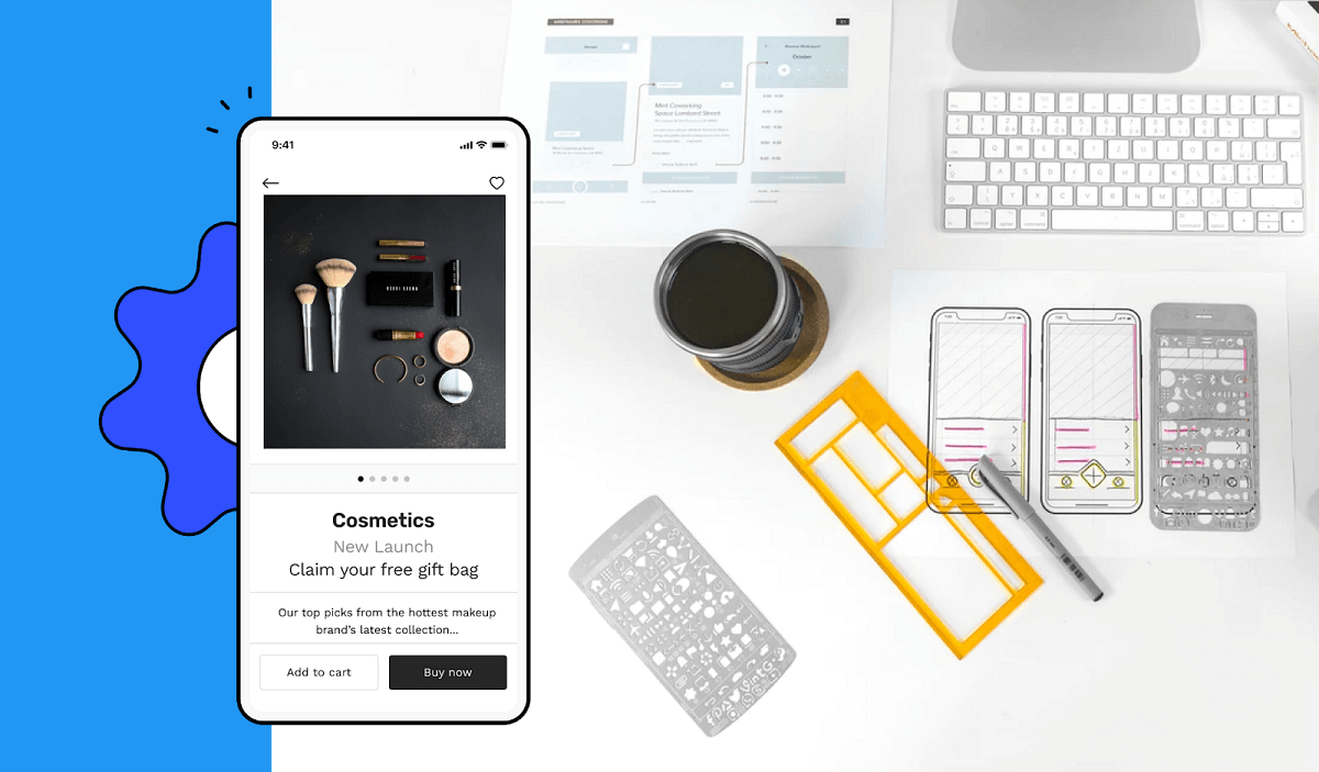
1. Create a prototype
Let’s create an interactive version of your app so we can think clearly about the UX. We’ve made this process simple with Builder Now.
We realised that most apps use the same features so we packaged them up into lego-like blocks. We use these blocks to let you quickly add complex features to your app’s prototype.
Begin with how you envision the app working from when a user opens it. What buttons should be available on the home screen? What happens when they click on that button? Think about each step of the user journey.
Once you’ve completed your prototype, it’s time to think about how you can optimise it. Plan the navigation so it requires minimal effort from your user. Think about what features of your app will be most used – that’s what you want to make prominent. We’ll expand on best design practices, but in short, keep everything intuitive.
2. Build your app
Your prototype looks awesome and you’re ready to bring your app to life. If you’ve been using Builder Now, then the process is very simple. Remember those lego-like blocks? Our AI knows exactly how much work is required for creating each of those features. This means you get accurate pricing and a set delivery date!
You could work with freelancers or other app development companies. If you go down this route, ensure you get a fixed price and discuss what happens if they miss the agreed deadline. It’s an unfortunate truth; several companies will wait until you’re mid-project before surprising you with extra costs. That doesn’t happen with Builder.ai. The price we say is the price you pay.
If you’re feeling ambitious and want to build it yourself, we’ve got you covered! Our ‘App programming languages: what’s best for you?’ guide answers the questions a new app builder might have.
App Layout ideas and recommendations
The rest of this guide will focus on practical design considerations. Some of them might seem obvious, but you’d be surprised how often they’re overlooked.
Follow OS guidelines
Are you in camp Android or iOS? If you have strong feelings either way then you’ll understand why this is important. Imagine if you downloaded an app that ignored all the navigation and animations you’re used to. Instead, they followed the design practices for the other OS. Take the time to read the iOS Design Themes or the Material Design guidelines if you’re designing for Android.
Intuitive
This is a continuation of the previous point. You want everything to work exactly as your users expect. This means you need to be continually thinking about the behaviour your users expect. Sometimes this will be making a relevant feature accessible, other times it can be making the next step clear.
However you design your app, ensure you keep it consistent throughout. There’s nothing worse than an app that changes how elements behave or modifies the layout on each new page. Consistency means that your users will have a more intuitive app experience.
Minimise effort
Continuing the theme, we want to make the user's experience require minimal work. This can be done by anticipating their needs and offering features that facilitate this. Think about saving their data, autofill and using mobile-friendly input options.
It’s also worth being aware of touch targets. These are the elements that users will interact with. You want these to be large enough that they’re easy to press. Also, make sure they’re not overcrowded – no one wants to click the wrong item by mistake. On a related note, think about how much of the screen your user can reach with one hand. Make it comfortable for them to use.
Lastly, think about what device features you can make use of. Offering fingerprint sign-in in your app is no longer a gimmick. It’s a time-saving feature that users have come to expect. Can you make use of location data or the call log? If not, that’s totally fine. We’re not trying to come up with creative uses, rather we want to save the user time whenever possible.
Simplify
When you first come up with an idea it’s easy to get carried away. You want to share everything your app can do at once. Bad idea – this is daunting for new users.
To make your app enjoyable to use, you need to simplify both the UI and UX. There’s a lot of ways you can do this. Start by removing clutter. Hide any features that aren’t regularly used behind an overflow menu. Your users will expect to look there if they need them. When it comes to visual elements, embrace minimalism! Whitespace gives your users time to appreciate the content you’re sharing.
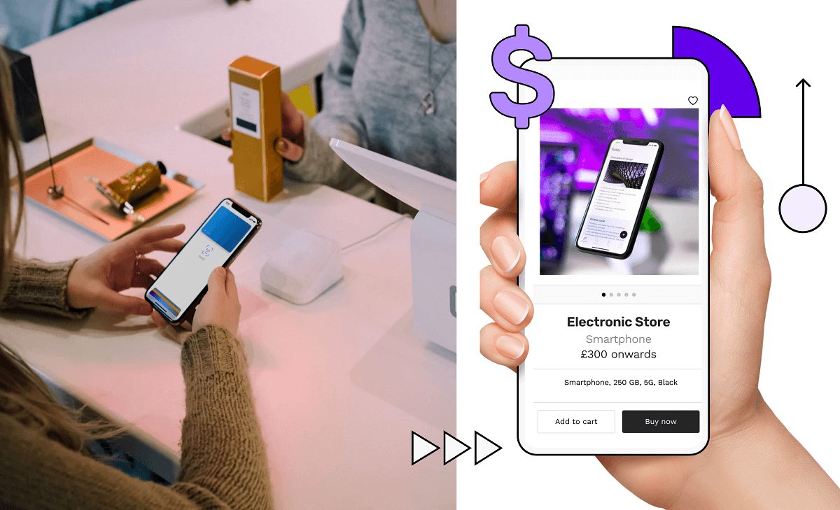
When it comes to the content, you want to present it in a way that makes the most sense. To do this and keep things simple we recommend chunking. This is splitting things up in a way that makes it easy for your users. A simple implementation would be using expansion panels to hide irrelevant information. Chunking is also a good idea when seeking user input. Online shopping is a great example of this. Think about how the checkout experience is broken up. This makes it much more approachable and helps prevent users from abandoning their cart.
Mobile design patterns
The checkout experience is a great example of a mobile design pattern. These are groups of design features that have become the expected standard. Don’t reinvent the wheel – it makes sense to use design patterns users expect. These won’t change in the near future so it’s a great way to future-proof your app design.
Just in case you thought it wasn’t a big deal... According to Marketing Profs, 26.8% of people uninstall an app because it was poorly designed or they didn’t understand how to use it. You don’t want your app to lose more than 1/4 of its potential users! Make your app simple and intuitive.
There are lots of patterns that have become somewhat expected: splash screen, home screen, login screen, profile page and checkout. Think across any app you use, these screens will all be very familiar regardless of the app.

Onboarding experience
This is a common design pattern that we want to explore. How do you teach users to use your app? The best practice will depend on the features of your app but there are two patterns we want to discuss. Both of these display the first time a user starts your app:
1. Paper onboarding
Show your users a short explanation of what your app can do before they get started. Normally this will be 2–4 pages long that users swipe through to learn the most important features of your app.
2. Empty state and overlays
If a user can customise their home screen – with a feed for example – it’s good practice to start with it empty. You then use an overlay that guides them through the process of adding information. They’ll learn to use your app and be more likely to hang around as you’ve helped them personalise it.
It’s worth spending a bit of time researching if there’s a mobile design pattern for any screens you think might be commonly used. Remember, keep your app design intuitive!
Mobile UI design
We’ll now look at some specific tips to keep in mind when designing your app.
Make it visually appealing
- Visual weight – several things such as size, colour and shape can affect how users direct their attention. Keep this in mind when designing.
- Colour wheel – this helps you quickly find colours that will work well together.
- No jargon – whenever possible use human-friendly terminology. A page covered in terms we don’t understand is not enjoyable.
- Rule of thirds – this is a useful method for designing images that direct our attention. Divide the image into 3 boxes by drawing 2 vertical and horizontal lines. The crossover point is where we direct most attention.
Make it easy
- Feedback on input – if you’re asking a user for input, highlight incomplete fields in red. You can also specify the type of data a field requires – e.g. a currency field should only accept numbers. Anything that’s not a number should give the user feedback. Using both of these features lets users know if they’ve done something wrong.
- Accessibility – always keep in mind how your design will appear to users with accessibility needs. For example, to accommodate users with colour blindness don’t just make an incomplete box go red. Use visual indicators such as a tick or cross to highlight the field.
- Help users find their way – give your users’ reference points that make it clear where they are within your app. This can be done with navigation menus and by using tactile feedback. An example of touch feedback is if a user scrolls too far, elements will get a little warped.
Built for humans
- A working back button – the back button should be intelligent. What do your users expect it to do in each situation? If they’re going through a series of steps the back button should send them to the previous step. There are lots of badly designed apps, where the back button always returns the user to the home screen.
- Don’t bombard users with permission requests – to learn everything you need to know about push notifications, see our guide: ‘Growing your business with push notifications’.
- Explain wait times – if something is loading give a visual indicator. No one wants to stare at a blank screen. How do you know it hasn’t crashed? Consider loading bars or skeleton screens to show progress.
- Error messages that make sense – if a user sees an error message, it should contain information that helps them solve the problem. What should they do next? How do they report the bug? This can be the difference between keeping or losing a user.
- Use feedback – before officially launching your app consider running focus groups or beta testing to get feedback. If there’s anything users find unintuitive, fix it! Once your app is live, make sure it’s easy for users to share feedback.
Latest app design and development trends
App usage continues to grow and there are some emerging trends you should be aware of.
According to Marketing Profs, 15.6% of people uninstall an app because of a complex registration process. This has been noted by lots of people and it’s quickly becoming standard practice to let users try your app before asking them to register.
Modern life is busy. There are lots of distractions and your app needs to be able to handle them. Your user might close their phone to chat with a friend. Will your app allow them to continue exactly where they left off? What happens if they lose their internet connection? Finding ways to elegantly handle these interruptions is a hot topic right now.
We can’t talk about development trends without mentioning new technology. AI is increasingly being incorporated into apps. Designers are finding innovative ways it can simplify things for the end-user: autocomplete, recommended playlists and automatic photo improvements to name a few.
Final thoughts
We’ve covered a lot, but it’s all pretty straightforward. Remember to anticipate the needs of the user and make everything intuitive. If you do that, you’re ready to design your own app. Want to make sure you remember all the best practices? Open Builder Now and create your app prototype. As you go through the process make notes on why you think we’ve designed things a particular way.
Good luck with your app!
FAQs - Mobile application design
1. How much does it cost to hire a mobile app designer?
The exact figure is going to depend on what you want your app to do. More features will require more time spent designing a coherent experience.
At Builder Studio we use an AI-powered approach that means your costs and timeline are worked out instantly by AI before you start. You choose the features you want, share any design ideas and our team of designers and app developers handle the rest.
2. How to future proof your design?
Make use of mobile design patterns. They’re tried and tested, which means they won’t experience drastic changes in the near future. Configure your app to use a design theme. This will allow you to easily make updates without having to manually update everything.
3. Does my business need an app?
Most businesses would benefit from an app, but it’s certainly not needed by everyone. Have a look at our ‘mobile apps for small business’ guide and see if an app is the right choice for your business.
4. I just want an app for my business. Is there a simple option?
If you want an easy-to-use mobile app designed by a team of professionals, consider our Studio Store apps. They’re prepackaged and deliver all the features you need to grow your business. You don’t need any technical skills to get set up – we provide hosting and help get you set up in the app markets.
5. What is UI/UX design?
User experience is commonly shortened to UX design. It’s the process of making all the user interactions as enjoyable as possible. During the design process, the user flow and expectations will be considered.
UI stands for user interface. This is a subsection of UX. It’s focused on the UI elements used in the interface designs. This includes buttons, text boxes, the layout of information and much more. UI designs are created with the goal of improving the UX.

